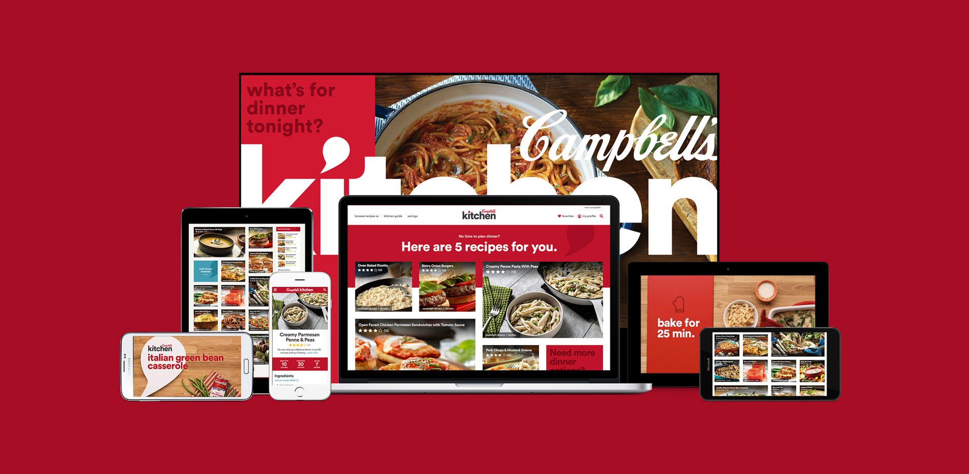
Campbell's Kitchen
CHALLENGE
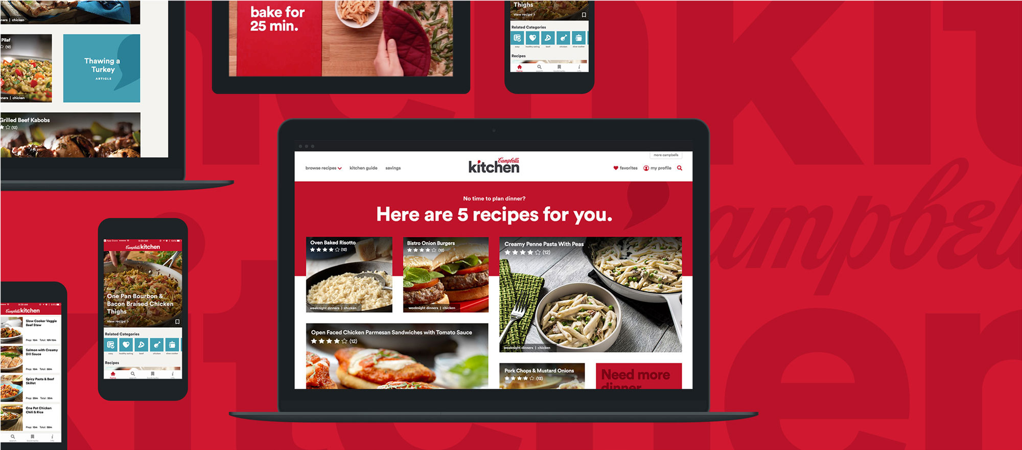
As part of an effort to enhance the customer experience, Campbell’s wanted to revamp their Campbell’s Kitchen Website and mobile application and deliver more utility to their customers.
SOLUTION
Rain delivered a contemporary new website with streamlined user pathing driving users to recipes that suited the needs of their family. The mobile application was designed to support users when they needed to be hands-free in the kitchen.
RESULTS
Sessions rose by 6.44% yoy and users rose by 1.15% yoy. We saw a slight decrease in page views per session. This could be attributed to the new streamlined site design which required users to click through less pages in order to browse the site.
MY ROLE
User Research | User Testing | Wireframing | Prototyping
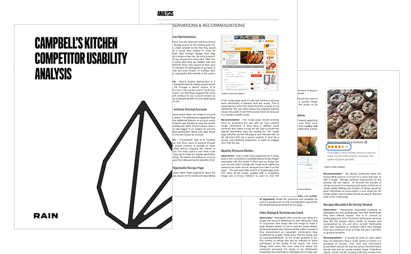
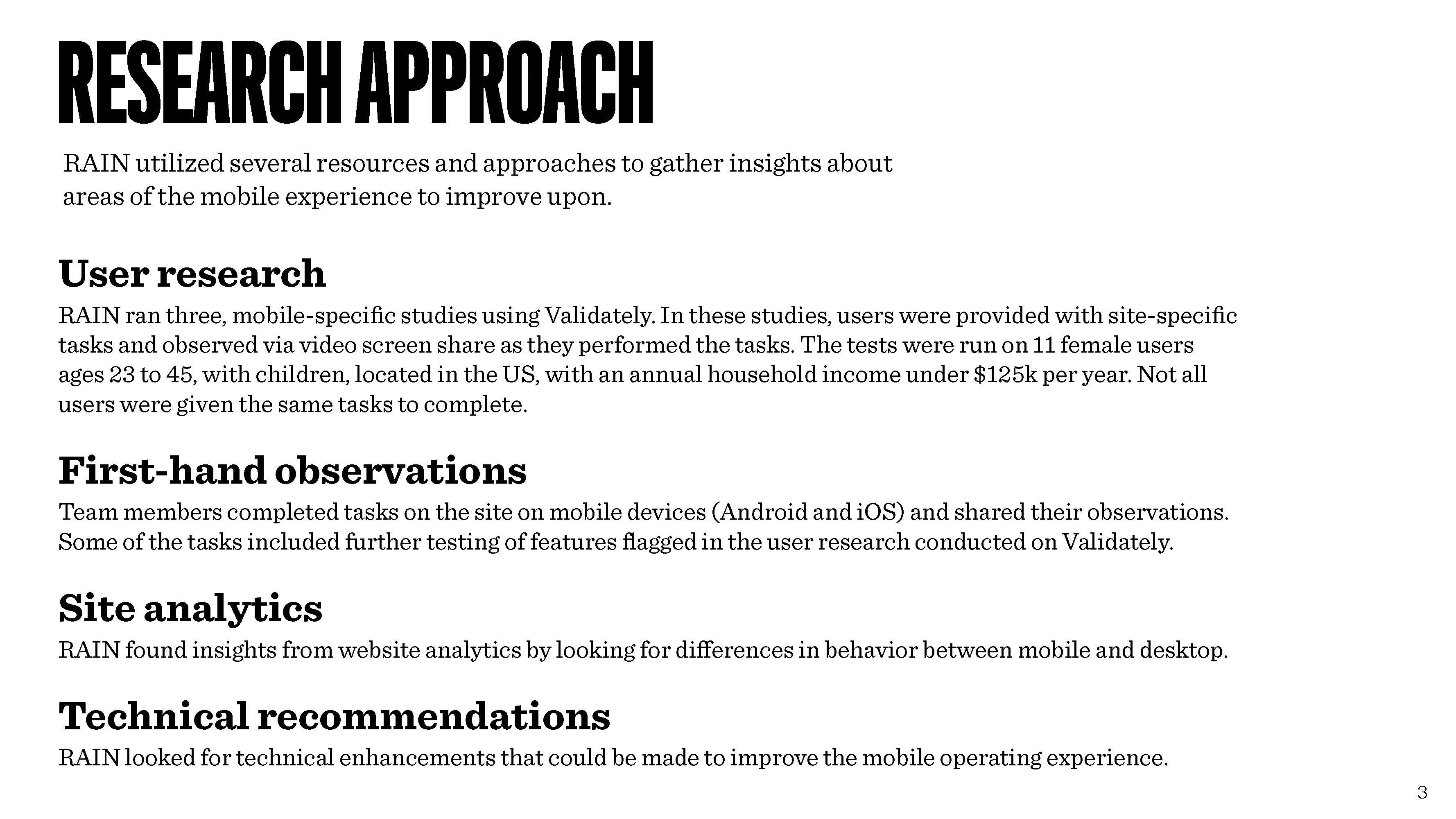
RESEARCH
My team and I conducted primary and secondary user research exercises which gave us insight into the mindset and needs of Campbell’s customers and how they engage with recipe websites.
KEY LEARNINGS
Deciding what to cook for dinner is a daily battle for families
For our users dinner is one of the many responsibilites they have as they care for their family. They needed universally appealing meal ideas that were easy to prepare and could be enjoyed by adults and children.
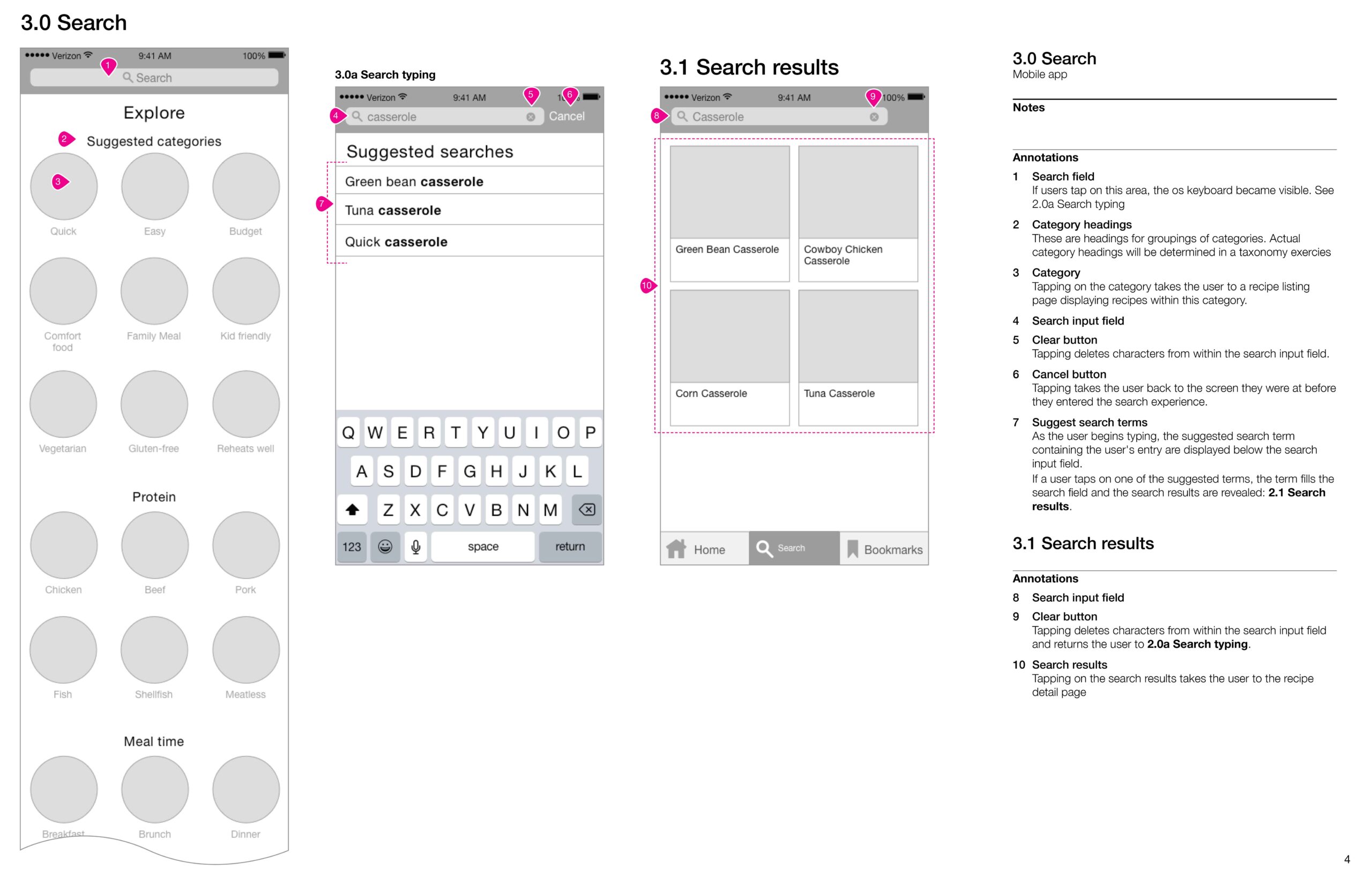
Quick and simple were key to browsing and searching
Our users were most drawn to recipe categories that communicated the recipes would be quick and easy to prepare. Users often scanned the recipe pages looking for cooktime indicators.
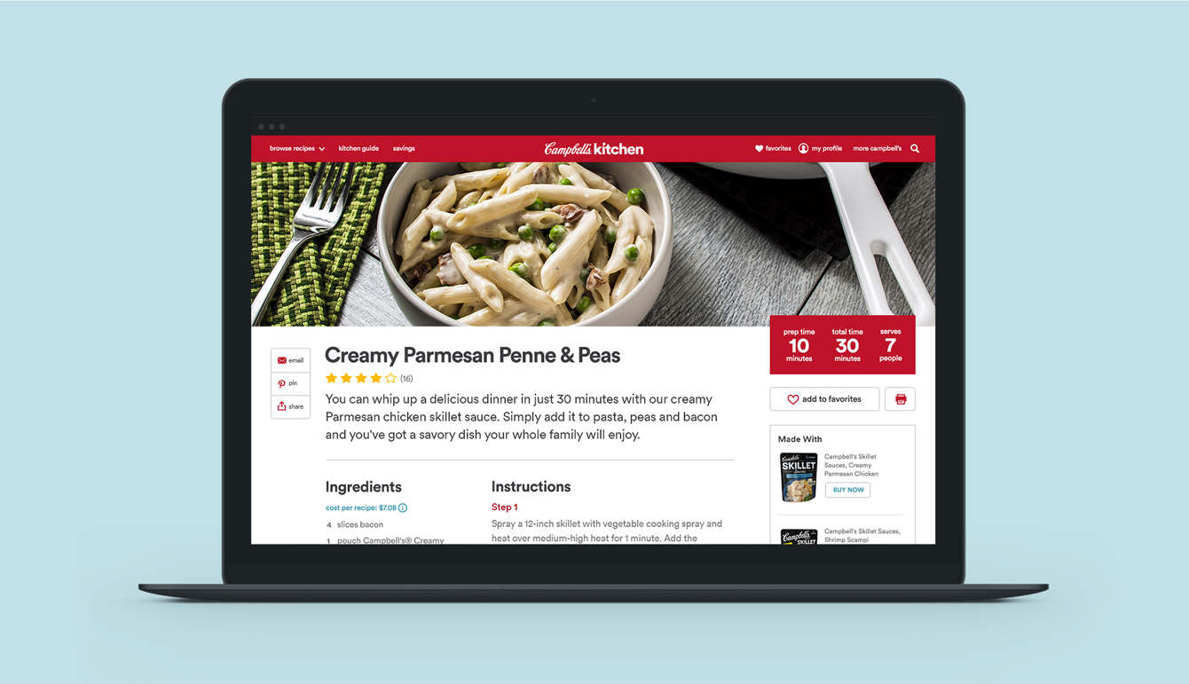
Photo grids drive recipe engagement
Users were highly drawn to screens where they could scan recipe images and make a selection. If a recipe didn't have an image, it was not considered.
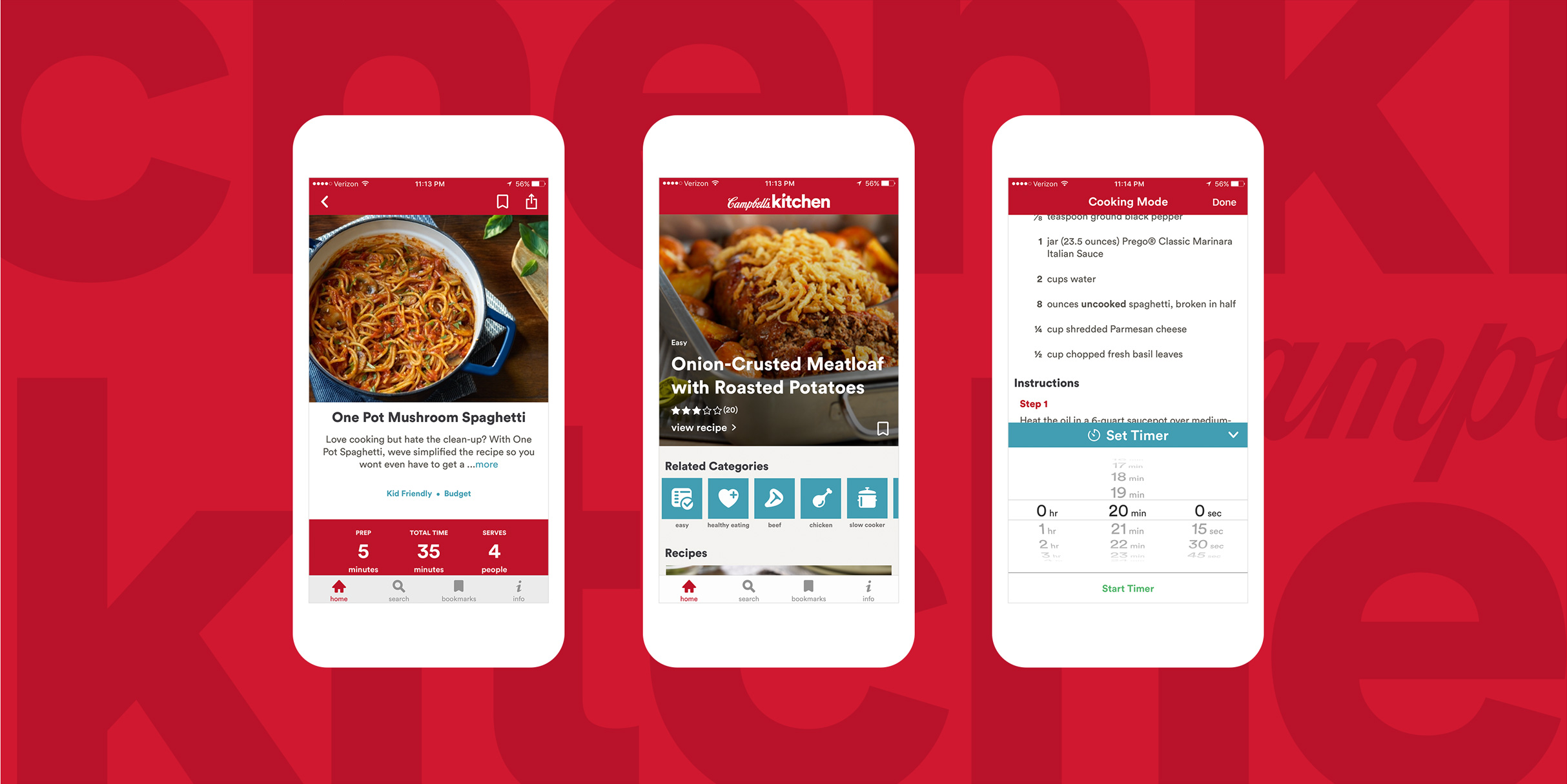
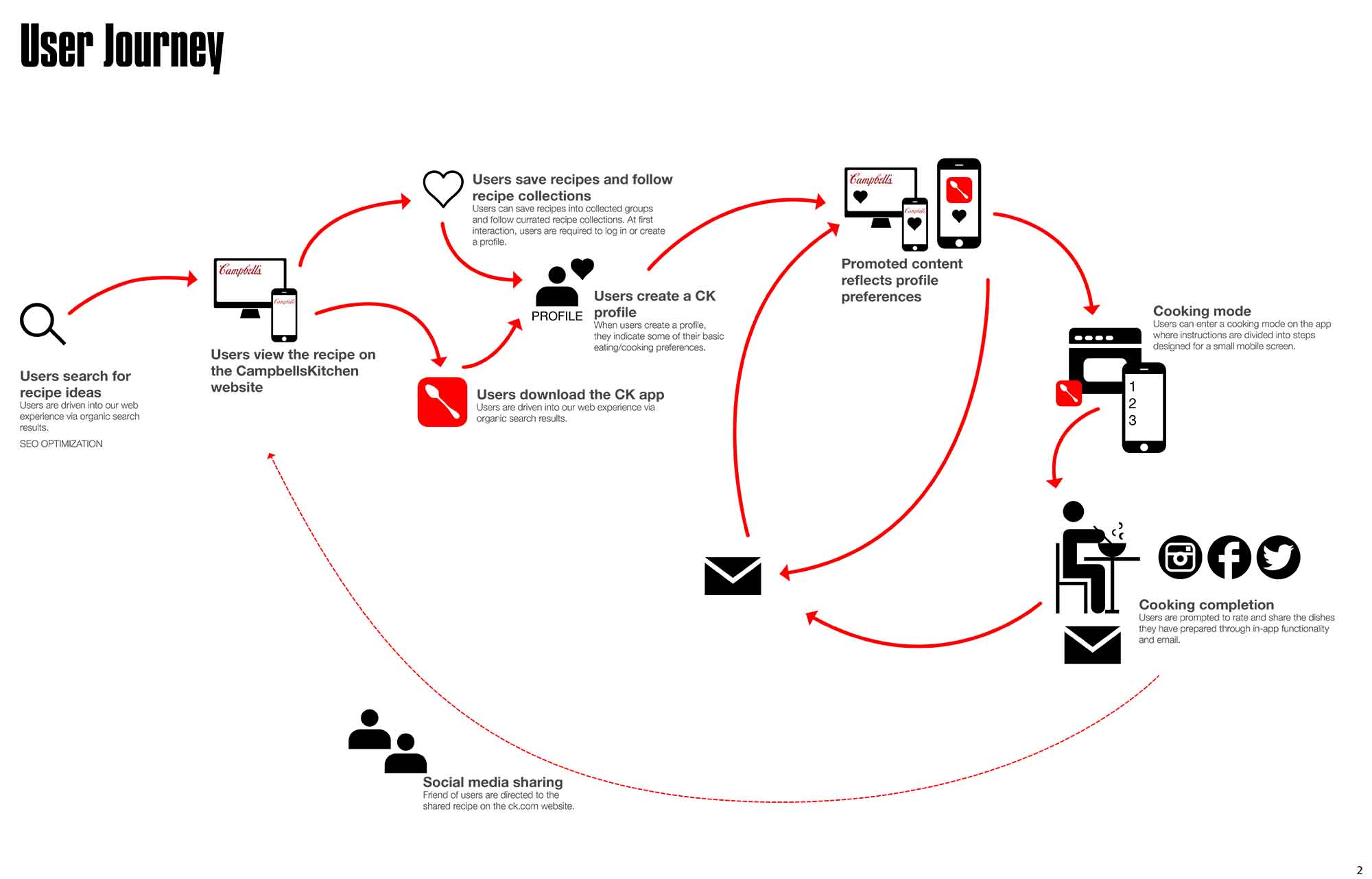
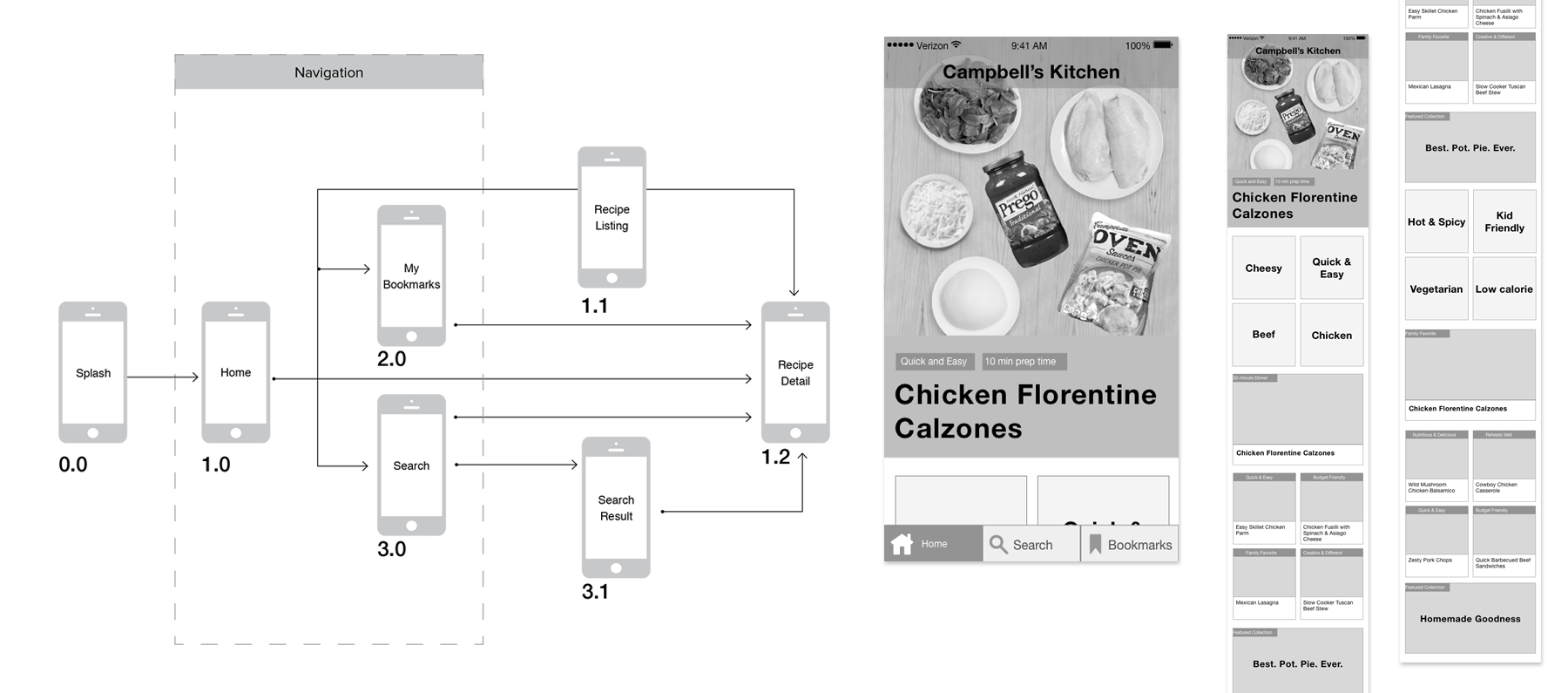
DESIGN AND WIREFRAMES
As I moved into the wireframing phase of the experience, I redesigned an experience that incorporated some key features and design changes.
As I moved into the wireframing phase of the experience, I redesigned an experience that incorporated some key features and design changes.
NEW FEATURES
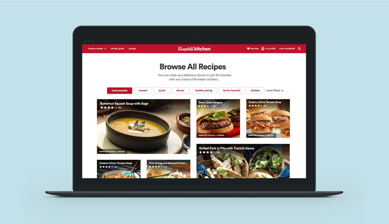
Categories and tagging
The addition of featured high-demand recipe categories and recipe tagging to drive SEO and user browsing.
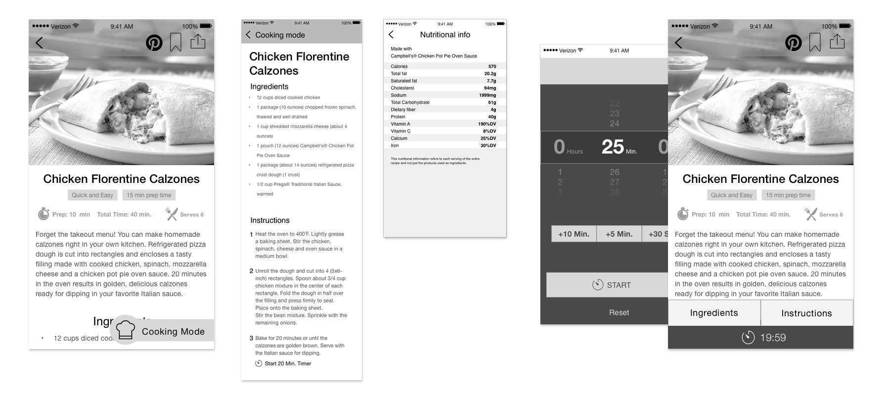
Cooking mode
A cooking mode with activity-driven UI providing quick access to ingredients, instructions, and a built-in timer.
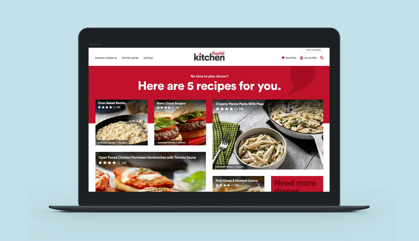
Browsing-driven homepage
Moving from a singular hero recipe image on the homepage to showcasing multiple recipes, enabling users to scan and select.
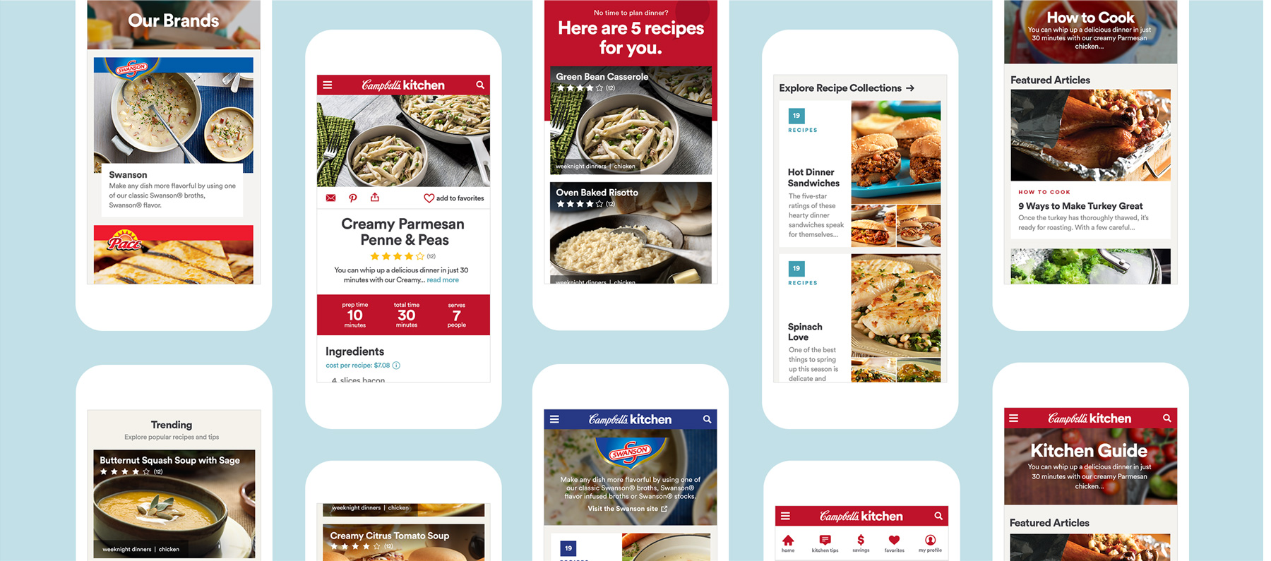
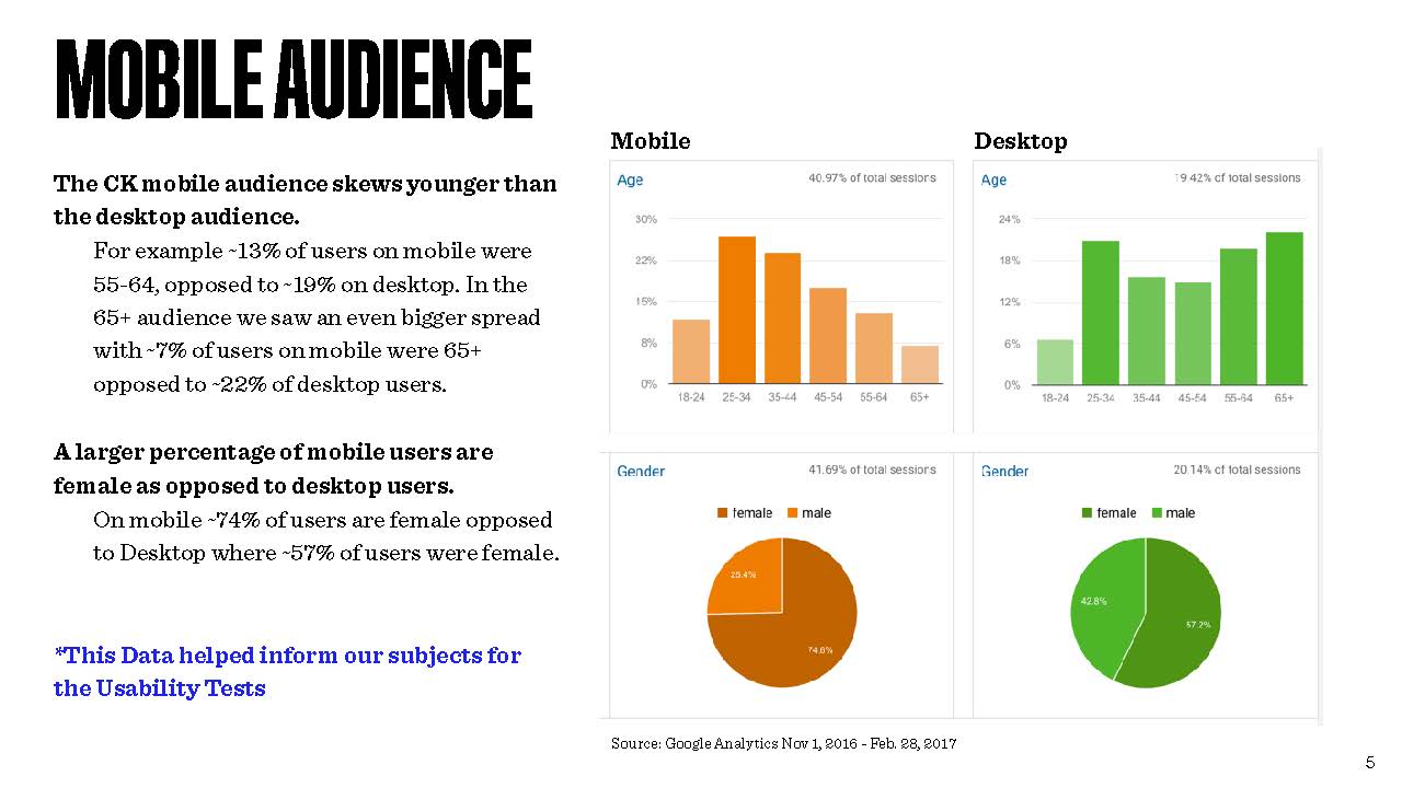
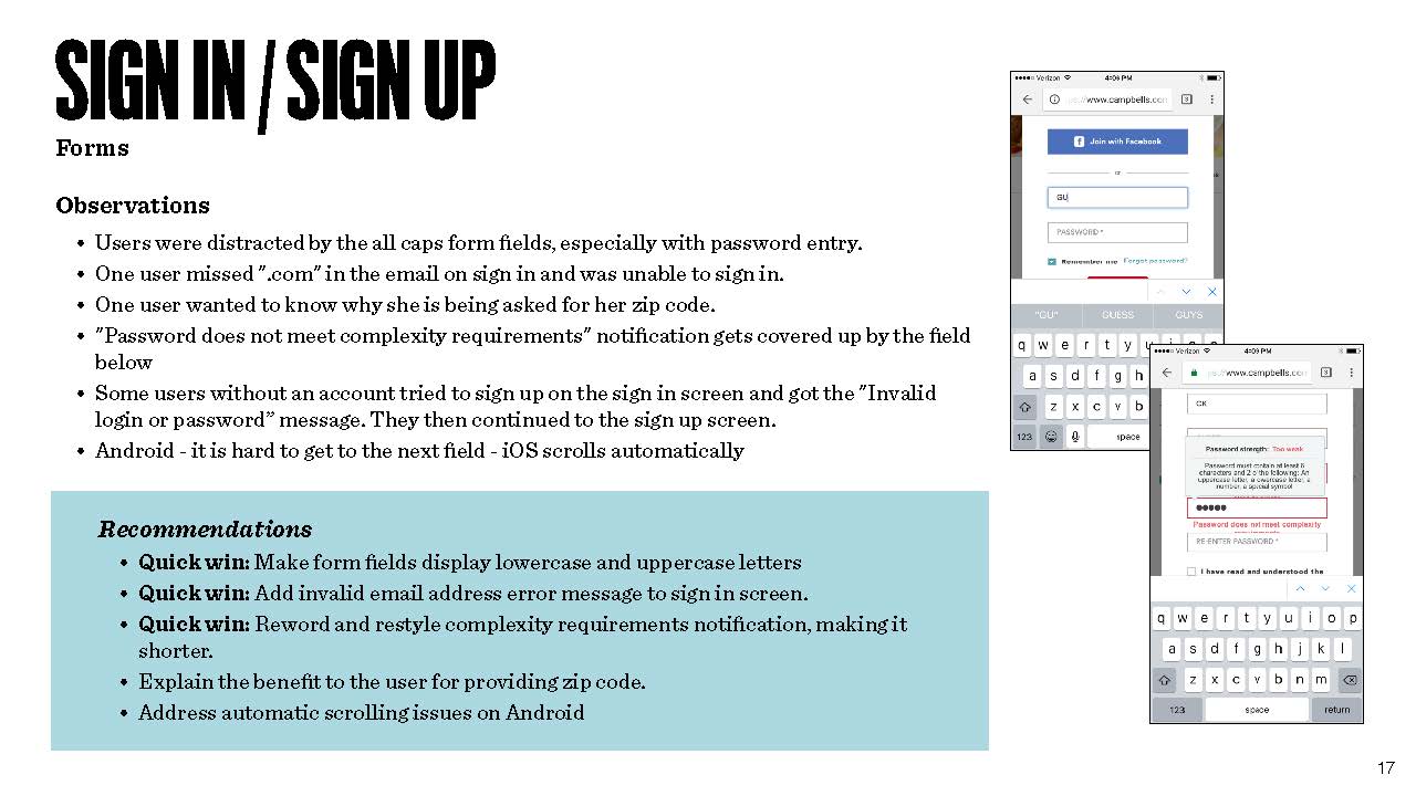
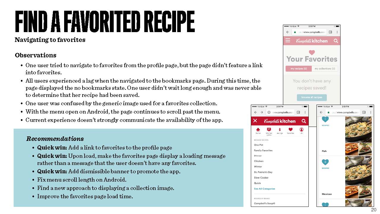
MOBILE TESTING
Following the site launch I conducted mobile-specific user testing to identify opportunities to improve the site experience for mobile users. See an excerpt of the output deck below.
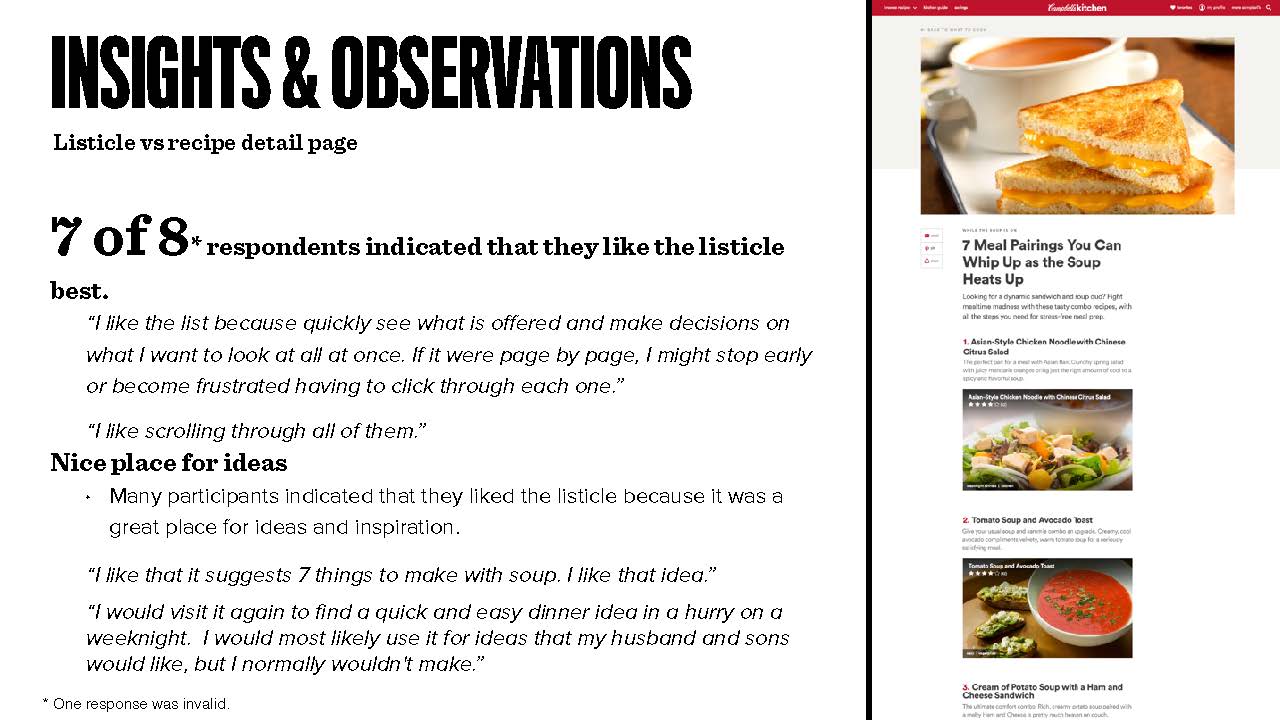
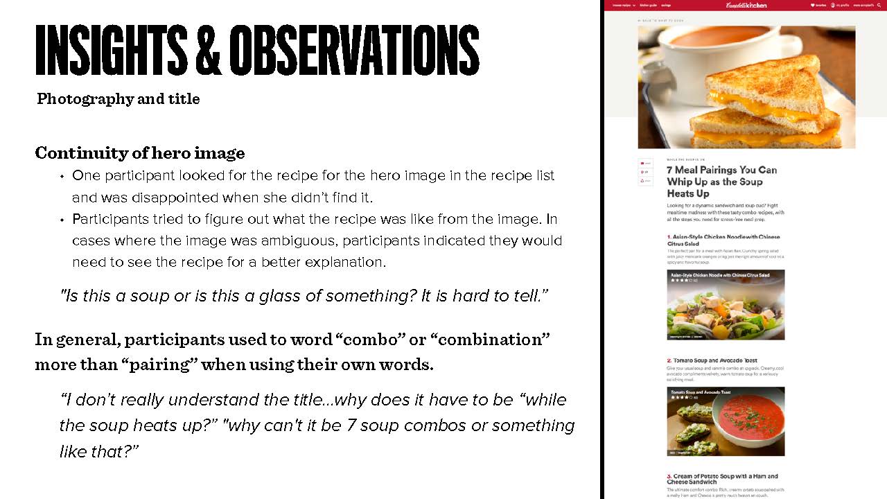
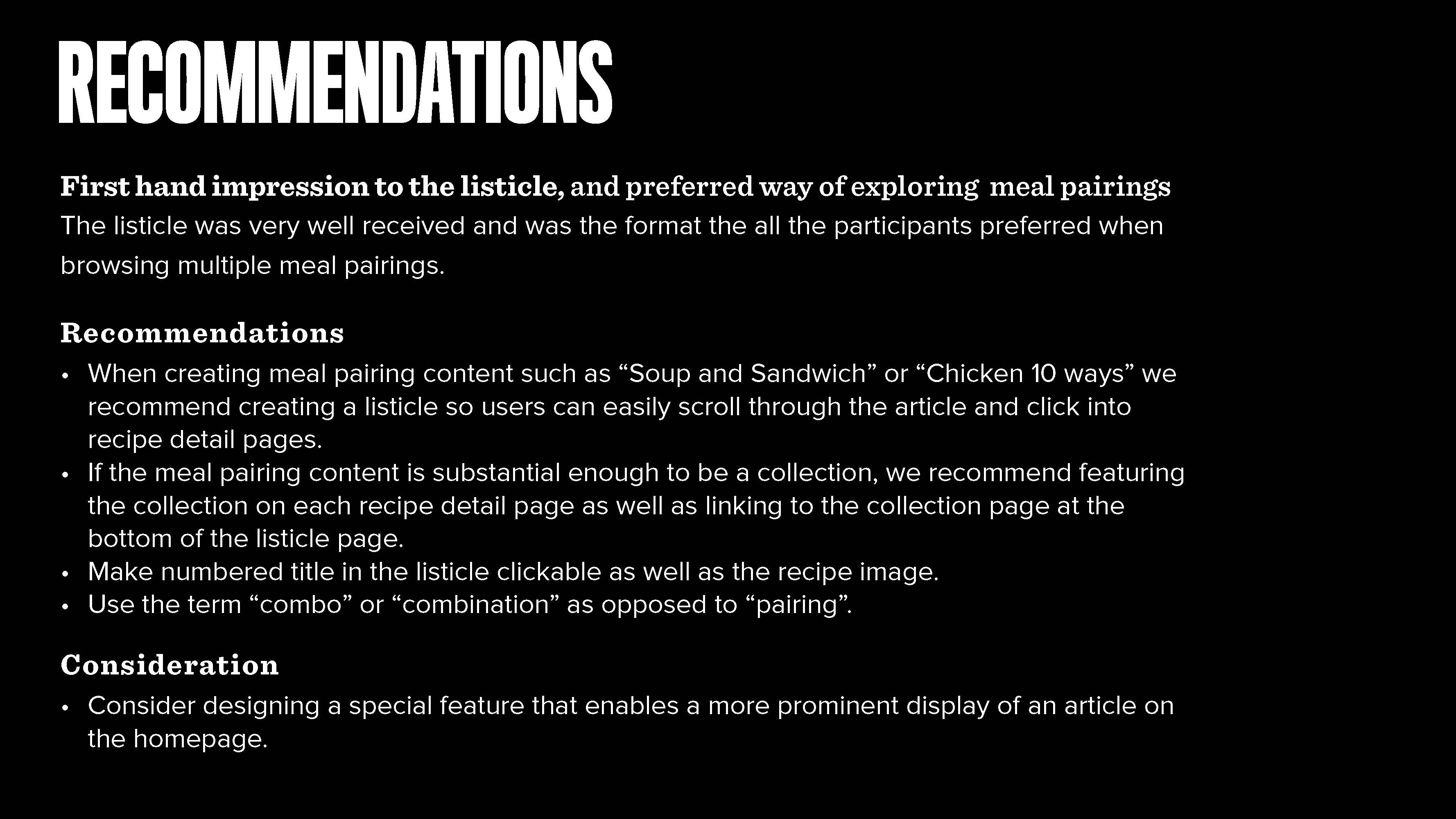
USER TESTING ON A NEW FEATURE
I conducted user testing on a new feature of soup meal parings. See an excerpt of the output deck below.
Selected Work

Digital CoachRelationship-building Platform

Health Data DashboardData visualization

Purchasing Knowledge HubB2B Product
Beachbody On DemandResponsive Website
Campbell's Kitchen Website / App

Star Trek: Discovery Alexa SkillVoice Experience
IBM Mobile World CongressExperience / Mobile / Website